Hidden Symbolism in Some Famous Logos
The FedEx Logo
The white space between the ‘E’ and the ‘X’ forms a perfect arrow, suggesting a company moving forward and looking ahead. It’s subtle, but now it’s all I see whenever the logo appears.
The Goodwill Logo
The iconic smiling face is in fact the ‘G’ in Goodwill zoomed in an cropped slightly. Clever
The Milwaukee Brewers Logo
The classic Milwaukee Brewers logo not only looks like a baseball glove, but the letters ‘M’ and ‘B’ actually form the glove! It’s too bad they’ve changed their logo recently, many prefer this vintage design.
The Pittsburgh Zoo & PPG Aquarium Logo
On either side of the tree, the faces of a gorilla and lion appear in white. In many of these examples of hidden symbolism, the ‘secondary’ imagery is often found by looking at the ‘negative space’ of the logo
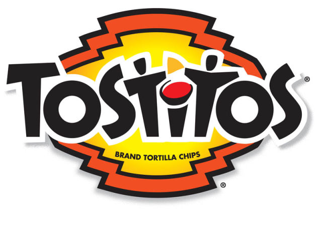
The Tostitos Logo
Who knew the logo was where the party’s at? The two “T’s” of this logo make up people, as they dip a tortilla chip into the bowl of salsa in the ‘I’. Fun stuff!
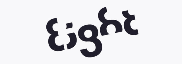
The Eight Logo
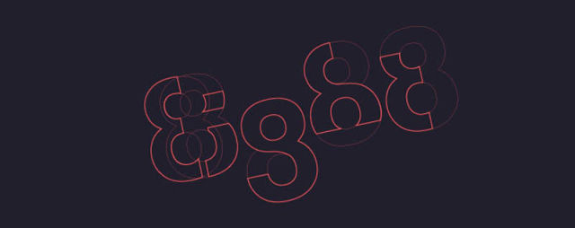
In this clever design, each letter is made up of a certain part of the number ’8′. The second image helps visualize this fantastic design.

The Amazon Logo
Did you ever notice the arrow from ‘A’ to ‘Z’ in the Amazon logo? The thought is that Amazon carries everything from… well you know the rest Some say it also forms a slight smiley face…
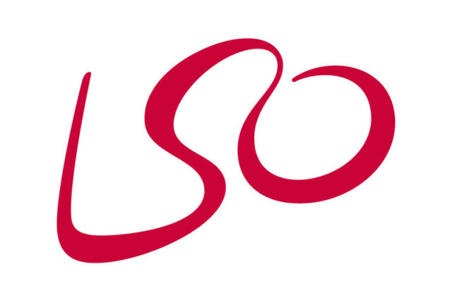
The London Symphony Orchestra Logo
This playful logo not only spells out ‘LSO’ but also looks like a conductor leading the orchestra with the ‘L’ and ‘O’ resembling his arms.
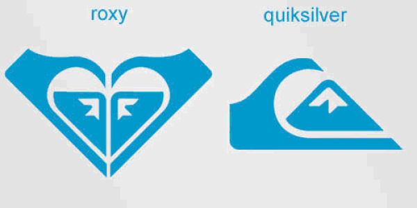
The Roxy Logo
Roxy is a clothing line for girls who love surfing and snowboarding. It is owned by Quicksilver and the logo consists of two Quicksilver logos rotated to form a heart. Awwww.
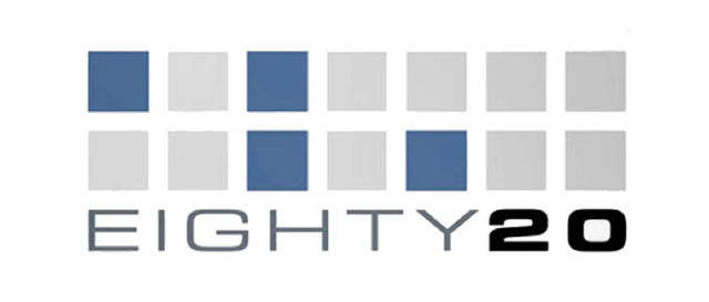
The Eighty 20 Logo
If you spotted the hidden symbolism you have earned yourself +2 geek points. The squares above the ‘Eighty20′ when read in binary (1010000 & 0010100) form the numbers 80 & 20 respectively.
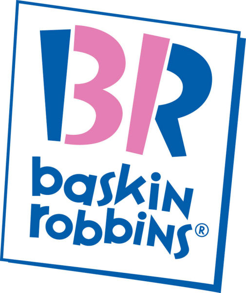
The Baskin Robbins Logo
The BR in the Baskin Robbins logo is made of two colours. When you focus on just the pink portion, the number 31 appears, denoting the number of flavours Baskin Robbins offers!
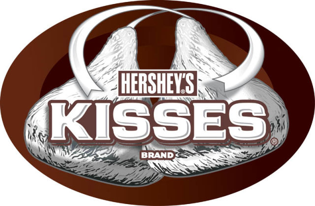
The Hershey’s Kisses Logo
The tasty Hershey’s Kisses logo is similar to the FedEx logo in that there is a hidden Hershey’s kiss between the ‘K’ and the ‘I’. You might need to tilt your head slightly to the left to really see it
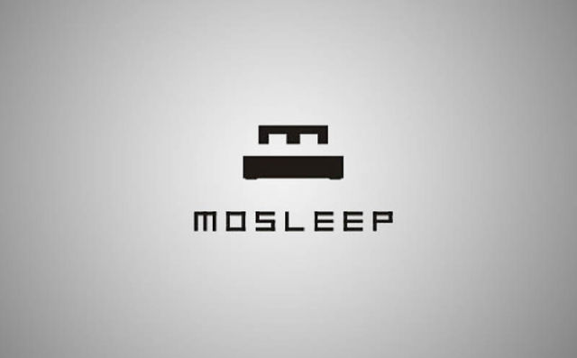
The MOSLEEP Logo
The Mosleep logo contains the letter ‘M’ in the graphic which helps complete the shape of a comfortable bed in the logo. Sweet dreams.
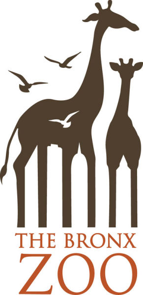
The Bronx Zoo Logo
Another ‘negative space’ gem is the Bronx Zoo logo, where New York’s iconic skyline of tall buildings can be found between the legs of the giraffes.
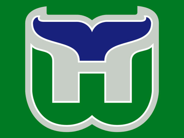
The Hartford Whalers Logo
The former NHL team the Hartford Whalers had a great logo. The ‘H’ can be spotted in grey between the green and blue, while the ‘W’ is formed in green at the bottom of the logo. Also visible in blue is the recognizable tail of a whale. Lots of imagery to be found in a seemingly simple logo.
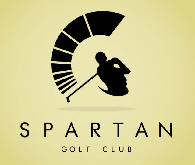
The Spartan Golf Club Logo
Looking head on, it appears to be a golfer who has just completed a drive, no doubt in the middle of the fairway! However, when you look at a side profile, the helmet of a Spartan warrior appears. Nice dual symbolism works well for this logo.
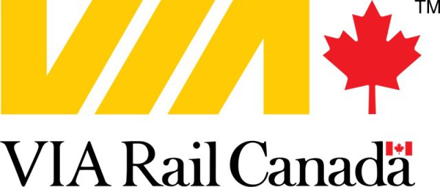
The VIA Logo
The iconic Canadian railway company VIA has a fascinating logo. If you focus on the white space between the ‘V’ and ‘I’ and then again at the white space between the ‘I’ and the ‘A’ you’ll notice two parallel lines representing railway tracks. It’s subtle but effective.
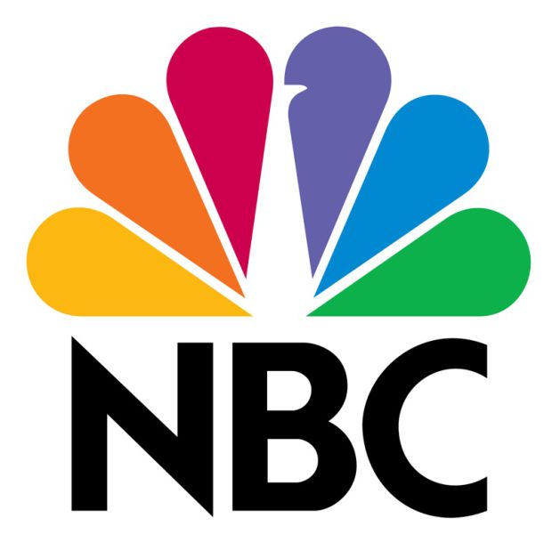
The NBC Logo
The iconic NBC logo has a peacock in white with five colourful feathers representing each division of NBC (when the logo was originally designed, as there are more now). The peacock is also looking to the right, often associated with looking ahead or forward.
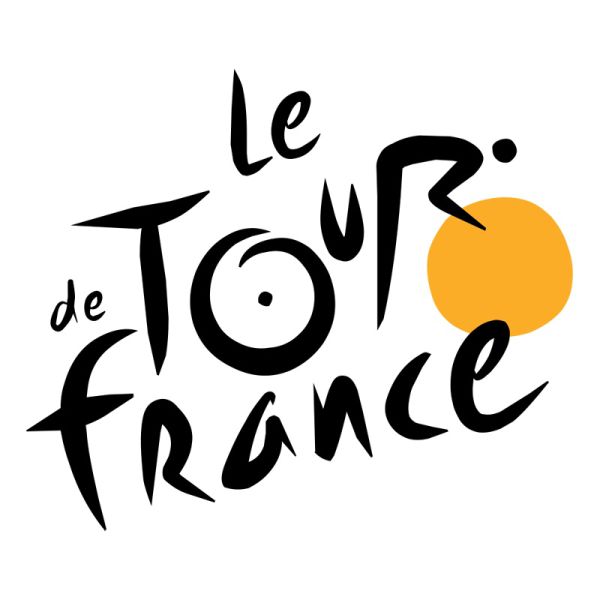
The Tour de France Logo
The Tour de France logo actually contains the image of a cyclist which can be seen in the letter ‘R’, with the orange circle symbolizing the front tire.
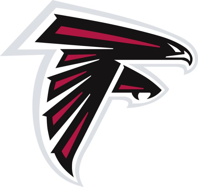
The Atlanta Falcons Logo
The logo for the NFL football team the Atlanta Falcons has an easily visible graphic of a falcon, but did you notice the shape of the bird also forms the letter ‘F’?

Some of these are obvious too :)